11 Trading Chart Patterns you Should Know

Chart patterns are graphical formations created by price movements on a chart, and repeated over time.
They give clues about potential future price direction based on historical market behaviour.
Today we will look at eleven (11) types of chart patterns and how to trade them.
(Before we proceed, note that the eleven chart patterns will be broken into three categories/groups: continuation, reversal and bilateral or neutral):
A. Continuation: This appears when the market is moving in an uptrend or downtrend. It can be spotted during price correction or retracement happening in a trending market.
Patterns under Continuation (most times) suggest that the existing, overall or dominant trend will likely continue after a brief pause:
1. Flag
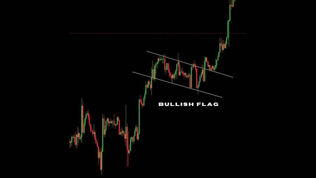
This pattern emerges when a market’s support and resistance levels form parallel lines. The lines can either ascend or descend. They create a rectangular shape on the price chart.
It is called a bullish flag if these lines slope downwards. Once the price breaks above the upper resistance line, it is often a signal that the upward trend is resuming.
And when the lines incline upwards, it is a bearish flag. A breakdown below the lower support line implies a potential continuation of the downward trend.
2. Wedge
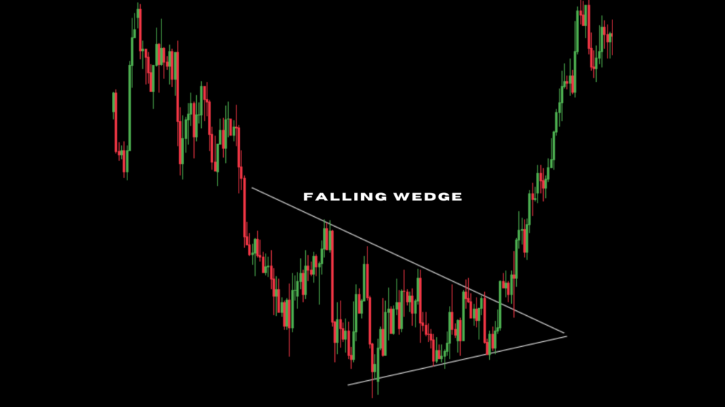
Almost similar to a flag, but here the lines tend to converge. We can see the lines gradually move closer to each other as the pattern forms.
When we notice the lines slope upward, we call it a rising wedge. It often precedes a downward price movement.
It is a falling wedge when the lines slope downwards. This behaviour usually points to a potential upward breakout.
3. Ascending & descending staircases
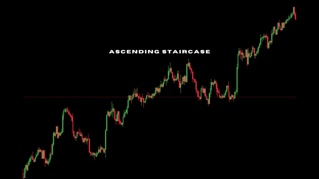
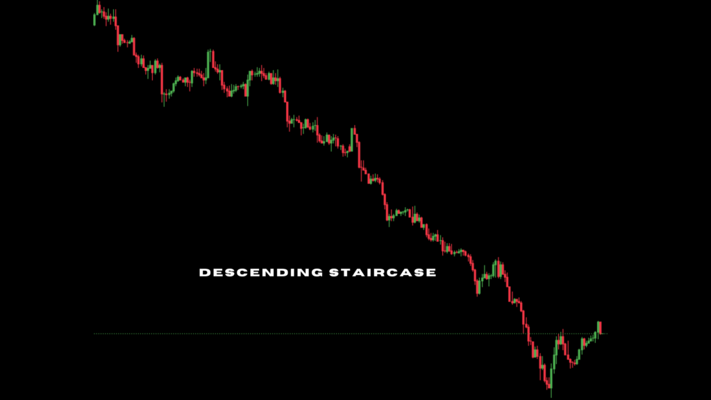
On ascending staircase, we can spot a step-like pattern (a series of higher highs and higher lows). The upward trajectory shows a bullish market.
A descending staircase does the opposite and signifies a downtrend.
On a chart, it is identified with lower highs and lower lows that looks like steps going downward. This downtrend implies that selling pressure is dominating the market.
B. Reversal: Patterns in this group usually indicate a potential change in the direction of the trend:
4. Head and shoulders

This one is shaped like a human head and shoulders. It consists of three peaks: a central peak (the head, which is higher than the two outer peaks/the shoulders). The base of these peaks forms a line called the neckline.
After forming the first shoulder, the price rallies to create a higher high (the head).
Next, the price retraces to the neckline, but rises again to form the second shoulder (usually lower than the head & showing a weakening buying pressure).
Head & shoulder pattern is confirmed when the price breaks below the neckline.
Here, it hints a downward trend. Sellers are dominating buyers, and the uptrend is likely to reverse.
5. Double top
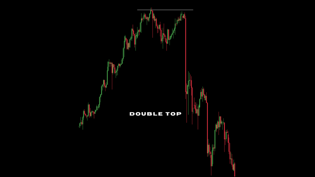
Double top is formed when a market reaches a peak twice with a minor dip between them (creating an ‘M’ shape on the chart). The second peak is usually slightly lower than the first.
It usually suggests a potential shift from an upward to a downward trend.
To confirm, the price has to break below the support level (that is the low point between the two peaks).
It is important you verify the support level to avoid false trading signals.
6. Double bottom

It is shaped like a ‘W’ on a chart. Double bottom takes place when a market price drops to a low point twice, with a temporary rebound in between.
These two lows represent failed attempts by sellers to push prices lower.
It shows that selling pressure is minimising and a potential upward trend is on the horizon.
So here we anticipate a likely bearish-to-bullish reversal.
You confirm the validity of this pattern when price breaks above the resistance level formed by the high point between the two lows.
7. Rounded top or bottom
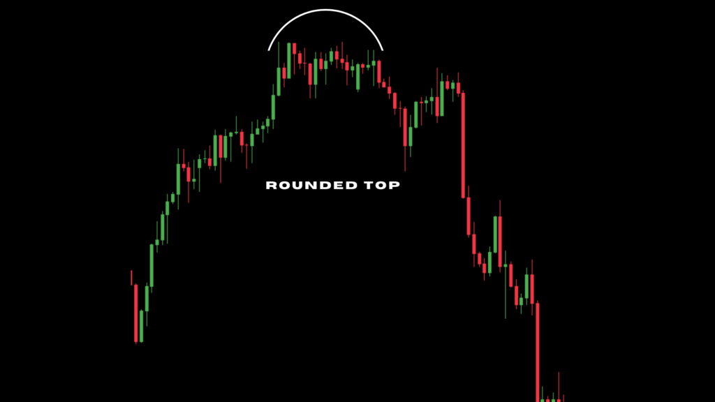

Rounded top: It looks like an inverted U-shape, and forms at the end of an uptrend when price action gradually loses momentum.
At first, there are higher highs, but as the pattern develops, these highs become progressively lower.
This suggests waning buying interest and a potential downtrend.
Rounded bottom: Appears like a U, & occurs after a downtrend. It often signals a potential uptrend.
Similar to the rounded top, rounded bottom involves a series of price points, but it lows gradually increase —meaning a potential shift from selling to buying pressure.
Unlike double tops & bottoms (which are relatively short-term patterns), rounded tops & bottoms often develop over a longer period.
8. Cup and handle
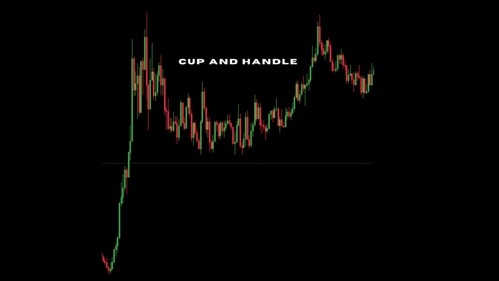
A cup & handle pattern is essentially a rounded bottom with an added twist. It starts with a U-shaped curve and, hints a potential reversal from a downtrend.
But after this initial recovery, the price undergoes a brief consolidation phase & forms a small handle-like shape.
This handle often resembles a flag pattern with its parallel trend lines.
Cup & handle is mostly gives a bullish clue. It tells us that buying pressure is increasing and that the market is preparing for a sustained upward move.
C. Bilateral or Neutral patterns: They indicate a period of indecision or consolidation in the market. Buyers & sellers seem to be evenly matched.
There is no clear dominant trend, we can expect the market can move up or down within this range. (These patterns do not give a strong sign on the next direction of the market):
9. Ascending triangle
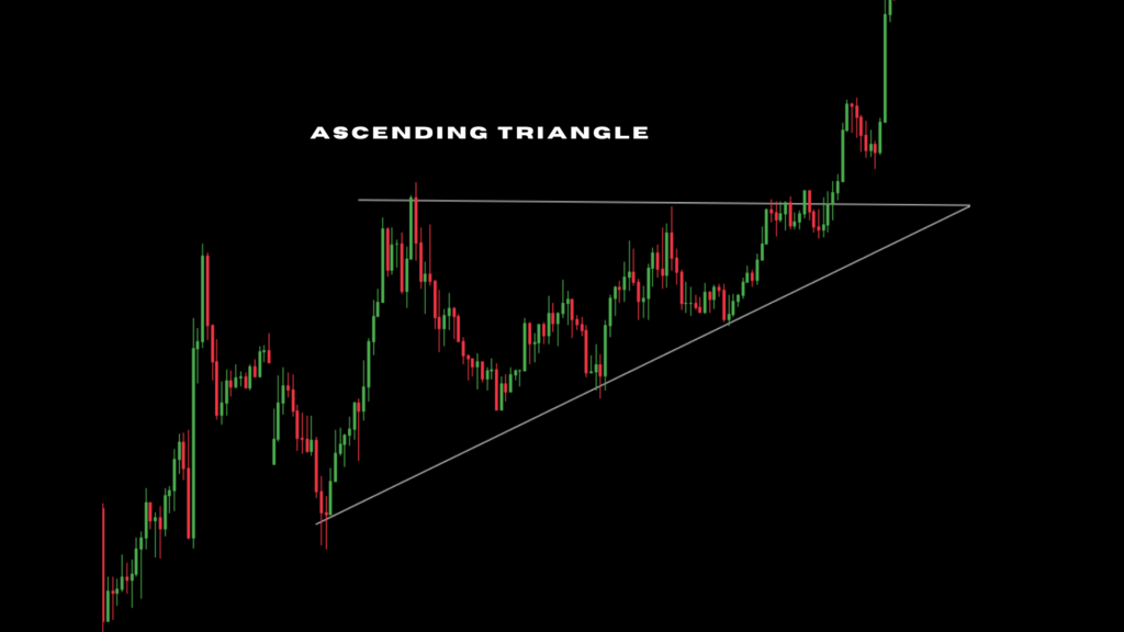
This one can be identified by horizontal resistance level, i.e, a number of similar highs and an upward-sloping support line. It often appears during a market consolidation phase following an uptrend.
As this triangle unfolds, trading volume tends to decrease due to indecision between buyers and sellers.
However, a breakout above the resistance level with an increased trading activity, would translate to a potential resumption of the uptrend.
While breakouts usually align with the preceding trend, it is important to note that ascending triangles can also precede a downtrend.
If the price breaks below the support line instead, or if trading volume continues to decline after the breakout, it could indicate a potential reversal.
Therefore, confirming the pattern through additional technical analysis is vital.
10. Descending triangle

Although descending triangle often signals a continuation of the preceding downtrend, there is still a possibility of a breakout in another direction.
A breakdown below the support level confirms the bearish sentiment and a breakout above the resistance is also possible.
To enhance prediction accuracy, you should analyse volume changes within the pattern.
Also, consider both potential outcomes, prepare & develop appropriate strategies for each scenario.
11. Symmetrical triangle
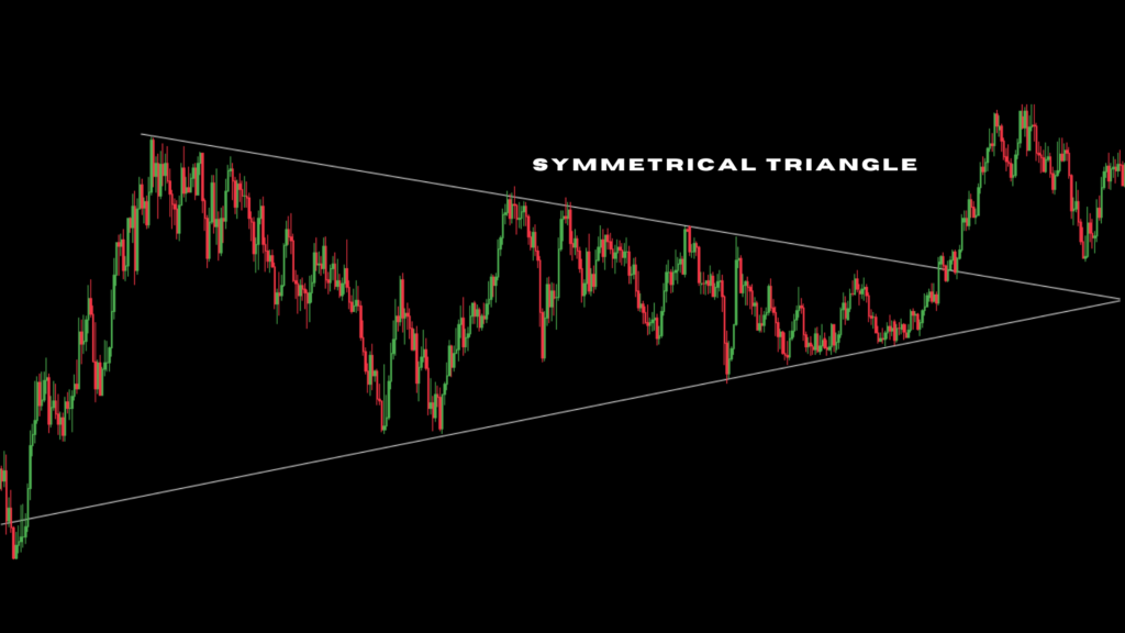
This triangle is formed by converging trend lines. One sloping upward and the other downward.
It is a period where buying & selling pressures are almost balanced.
It is mostly a bilateral or neutral pattern. It can signify a continuation of the previous trend or a reversal. This makes it a challenging pattern to predict.
It is regarded as a continuation pattern if the breakout follows the direction of the preceding trend.
But when there is no established trend before the triangle forms, the breakout can occur in any direction.
So it is safe to wait for a very clear breakout above the upper trendline or below the lower trendline before entering a trade.
Once you confirm the breakout, monitor price action closely to determine the new trend direction.
In order to achieve success with chart pattern analysis, utilise other technical indicators like volume and momentum indicators with a solid risk management plan.
This would help you pinpoint high-probability setups and protect your capital.


